UX | User Experience | User Interface
Supreme Court Justice Potter Stewart (an incredible old-timey name) is most famous for a particular quote.
In the case Jacobellis v. Ohio, he and the other Justices on the court were being asked to, in essence, determine what constitutes obscene content, something that is notably subjective and difficult to pinpoint. In response to this seemingly difficult assignment, Justice Stewart came up with a rather simple, straightforward criteria:
“I know it when I see it.”
We bring this up because you could say the same thing about user experience, or UX.
It can seem somewhat hard to gauge what separates good UX from bad UX. Except it really isn’t. Because you know when you’re using something that isn’t working well. You also know when you see something that works as intended, without any friction whatsoever.
In this Complete Guide to User Experience, we’ll explore precisely what user experience is and how to visualize, develop and refine UX that hits the sweet spot for your users, even if they don’t know the hard work that went into making it feel seamless. Instead, they’ll just know good UX when they see it.
What is User Experience?
At its heart, user experience is how a person feels when interacting with a system.
How Is User Experience Different from User Interface?
User interface, or UI, is the look and feel of something, the aesthetic nuts and bolts of what the user interacts with. It’s concrete.
User experience, on the other hand, is entirely contingent on the individual’s reaction to that interface. It’s visceral. It’s subjective. It’s environmental. It’s an emotion.
Think of it this way. Let’s say you go to a museum to see a piece of art. When you look upon the art, you’ll have a response, good or bad. This response is dependent upon the aesthetic choices of the artist, but also your own personal history and preferences as to what constitutes a masterpiece as well as the mood you were in when you first approached.
In this scenario, the art itself is UI, but your reaction to it in relation to you is UX.
Influencing UX Through UI
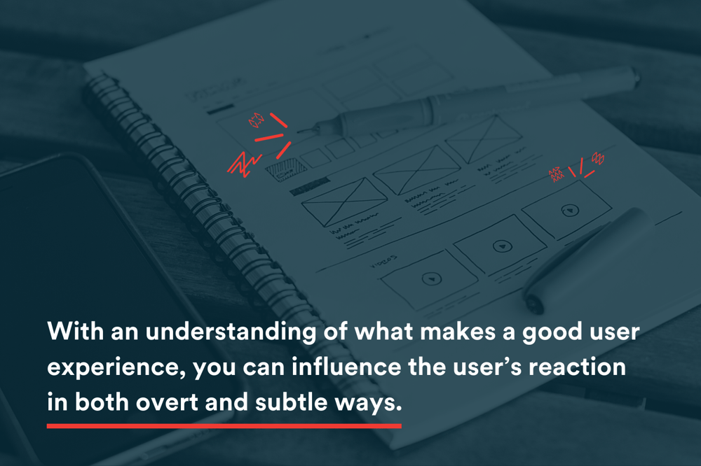
With an understanding of what makes a good user experience, you can influence the user’s reaction in both overt and subtle ways. You have no control over an individual’s personal history, but you can certainly anticipate that history and design your product in a way that drastically increases the odds of a positive experience.
In software design, this requires a deeper understanding of the individuals using a given product, through a methodology that is both proven and repeatable. The company IDEO coined the phrase Human-Centered Design, which is a great way to think about who your product should be geared toward and how to approach design.

Understand Your Goals
Before you even begin the design process, you need all key stakeholders on board with the goal. Sometimes, this goal can be as simple as a user completing an online checkout. You would therefore want to design something that makes the process of selecting a product, adding it to a cart, and checking out as seamless and foolproof as possible.
Develop Criteria for Measuring UX Success
Once you’ve established a goal, you can then move on to establishing the parameters for judging success. Typical parameters are measurable and would include things like:
- Time required to check out
- Value of the cart
- Number of items in the cart
- Items left in cart
- Bounce rate, i.e. where and when are people exiting the process?
All of these and more would provide guiderails for judging the value of your user experience and providing insight into where you can iterate to improve things further in the future.
Avoid Assumptions
One of the biggest missteps you can make early on in the process is assuming things from your own experiences and basing your eventual design on those assumptions. Having a hypothesis is great, but you absolutely must test your hypothesis with data and informed insight before, during and even after you design your interface.
Here are some things to remember in order to avoid common errors in the UX development process:
- You Are Not Your User
You will, by virtue of your position, be too close to your product to be unbiased. Whatever you presuppose to be the base level of knowledge that everyone has about your software, widen that base when designing for an end user to reflect that they might not know as much as you think. - Design Should Support Your Goals, Not Vice Versa
Everyone would love the cultural cache that comes with being the next Facebook or Apple. But their products are designed the way they are based on intensive study and to support their specific business goals. Your user experience should be designed from the ground up to support your business goals, and design should follow suit. You should never seek to design first based on what you think looks great or what others have done well, because trying to back into problem-solving will prove difficult. If you need to re-invent the wheel, you’d better make sure you need a wheel in the first place. - Ensure Accessibility
You need to design your user interface to account for accessibility for all users, as this will impact their user experience. Not only is this the right thing to do and will endear you to your end users, but not doing so could get you into legal trouble. - Have a Mobile-Centric Mindset
Too many products are designed with a desktop-first mentality. The truth is, a large section of your user base, if not a majority, will interact with your interface on a mobile device. And even if you currently have a desktop-exclusive application, the technical landscape might evolve to facilitate a move to mobile. You should design with mobile devices in mind from the start to prevent long-term difficulties. - Develop Content Concurrently
Populating your interface with lorem ipsum text (i.e. the fake, Latin-looking placeholder text that goes into a layout to show how things might look) is an easy way to quickly create a visual. However, it’s only upon populating your layout with content where you begin to expose utility flaws and see where your design might fall short or where you have too much or too little space dedicated to text or images. Pulling your content team in from the start, and working with them across iterations of the product, will ensure your design elements align with your technical elements. - Avoid Over-Design
As you develop your product, it will be tempting to throw in every bell and whistle at your disposal. But when these ideas are brought up, ask yourself: will this help solve the original problem we set out to address? Good design goes unnoticed, and overly designed products with unnecessary flourishes have a tendency to call attention to themselves without improving the user experience.

Develop User Personas
Before you begin designing your user interface, you need to understand who your users actually are. How you approach design of a roller coaster, for example, will be very different if your audience is primarily fearless teenagers versus older, motion-sick adults.
Knowing who your audience and userbase are will determine how you approach designing the user interface in a way that creates a positive user experience. Ask yourself questions like:
- How old is my typical user?
- Will my users primarily use a mobile or desktop device?
- What professions are my average users?
- How tech-savvy are my users?
- What are my users’ common challenges?
- What are my user’s motivations and needs?
All of these things will determine the best way to approach the design of your product.
One important note: you want to design for both typical users and not-so-typical users. A common shortfall of user interface is to assume a level of experience that not all users will have. For instance, an individual who has engaged with online shopping primarily via Amazon and a one-click, instant experience could balk at anything even slightly more complicated. You don’t want to lose business because you presupposed a level of tech-savviness that not everyone will have.
Designing with accessibility in mind will save you lots of headaches (and further development hours) in the future.
Build and Test Your User Experience
Because you’ve put in time to understand and validate (or, in some cases, reevaluate) your perception of your users, you’ll be in a good place to develop user interfaces in a way that positively influences the user experience.
You’ll want to start simple, sometimes literally with a dry erase board and some box diagrams, just to get your team on the same page and visualize that which was previously theoretical. This is where you can and should poke holes in your assumptions and test your theories.
It’s important to consistently test the user experience even at this early visualization stage, just to make sure you’re staying on track with addressing a user’s needs & expectations. What you assumed about how to present information architecture, i.e. the elements the user will see, how they’re outlined on the page, and how navigation of these various elements play out and how they’ll be used, might be different once you get the product in front of an end user.
Hopefully, because you validated your proposed solution and its user interface early on through persona development, you’ll have your assumptions confirmed during testing. But there may be moments where your preconceived notions are thrown for a loop. That’s okay. You’d rather have this happen now, in the early going, versus it happening after a product or product update has been rushed to market.
From a cost perspective, the further down the development cycle you get, the more expensive your efforts to correct the interface will become. You want to conduct as much validation as possible in the visualization stages so the corrections made downstream are smaller and smaller.
Only after initial framing and testing are complete should you conduct the hard but necessary work of coding the product you spent so much time understanding, exploring and validating (a process that will continue throughout the life of the product). It’s during the execution phase where you’ll bring in even more sample users, asking them questions about their experience with the live beta version of the product, fine-tuning further based on what you discover during this “task-based” testing.
Finally, after building your interface with a user’s experience in mind, you’ll be in a spot where you’re ready to implement your product. But good UX doesn’t end there.
Perfect Today, Obsolete Tomorrow
It doesn’t matter how much you test, how many focus groups you work through, or how many users go through your established workflows: no sample size will ever prepare you for the deluge of feedback and experiences that happen when you launch your product.
This is the ultimate test of user experience. Releasing a product or product update will generate a level of feedback you’ve never before encountered. This data will reveal aspects of your product and user journey that you hadn’t considered, influencing future business direction and, in turn, where to place and extend your focus.
But the good news is that the process of understanding your user’s needs and testing has prepared you for what comes next. And you’ve probably already guessed what that is:
More testing.
User experience is a collection of impactful decisions. It can be intentional (what we suggest) or accidental (unintended during interface design but with a notable influence nevertheless). When you see things from that perspective, it’s clear that UX should never be a one-and-done endeavor.
The data that comes from going to market is invaluable to further customization that pleases your users and has a positive business impact for your organization. What you learn from going to market, and from being in the market, will provide further clarity around your users and their needs, how they interpret your interface, and what their experience is like.
There’s a reason software updates are so frequent. They’re necessary to reflect the ever-changing preferences of the user. Best practices evolve over time, and a product that looked great in 2019 may already start to look and feel outdated in 2021. Constant refinement through the UX process ensures you’ll remain at the cutting edge long into the future.
Your users won’t necessarily understand all the hard work that went into creating a fantastic user experience. But they’ll know it when they see it.


