Company News | News | Technology
Static Images
I’ve been on the prowl for several years now for the perfect solution to bridge that communication gap between designers and developers. I’m a “graphic” (read: print) designer turned web designer turned UX designer. Like many print-turned-web designers, I started with Photoshop as my primary communication tool. My first hand-off to developers involved static images made in Photoshop thrown over the fence with crossed fingers that a decent-looking screen would come out alive.
More often than not, it didn’t.

It seemed like my screen would start as a masterpiece of visual design …

… and be turned into a design catastrophe.
Overlays
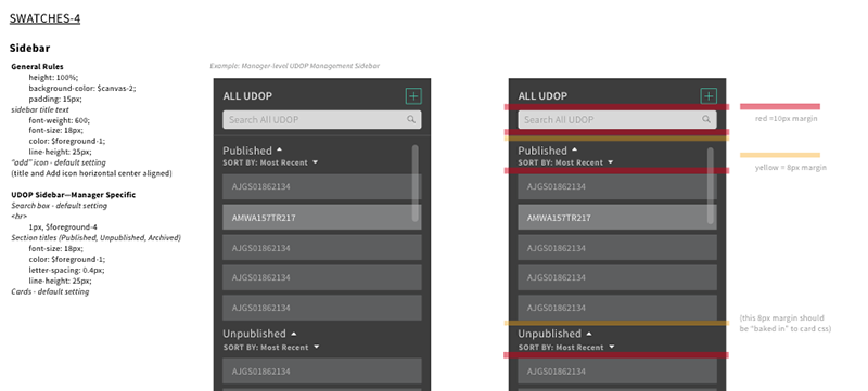
In the next phase of my journey to effectively collaborate with developers, I attempted to regain some control. I started including an overlay version of a screen with spacing, font, color, and other details for the developers to use in implementing the design. These overlays resulted in an initially improved screen layout, but the outcome didn’t seem worth the time and effort it took. It also wasn’t a very flexible or extensible process, as I had to rework the specs when any new feature or functionality was tweaked on any given screen.

Overlays were a nice stop-gap for the developer and me.
Code
Next, like many other designers also do, I decided to learn HTML/CSS and some JavaScript in an attempt to just do it myself. This learning endeavor, while good for my general knowledge and expanding skill set, turned out to be quite time-consuming, something my boss at the time didn’t love. She was the CEO of a fast-paced startup and didn’t see the need for the designer to do development when the developers were paid for that. And yet, she was also frustrated when the development effort didn’t turn out as pixel-perfect as my design. This was an especially frustrating phase of my journey, as I felt like I was failing at communicating with the developer (and wasn’t sure how to remedy that) AND still stuck in the time-consuming Photoshop + overlay process.
UI decomposition
Thanks to co-worker Andrew Wirick, I learned about the UI decomposition approach in which I attempted to systematically design and document all the parts and pieces of the atomic design I wanted the developers to implement and re-use.** This atomic-like design approach proved helpful for the web-based style guide for the developers to create, maintain, and share with other developers who were part of that web app project. However, the documentation aspect in which I was still manually typing out padding and margin, colors, fonts, etc. was time-consuming and wasn’t easily updated or dispersed to my developers.
Zeplin
Then I stumbled onto a new app called Zeplin. Zeplin is a web-based tool and desktop app created specifically for designer + developer collaboration. Developers can open a Zeplin project, see the components and elements of a design, and select objects for more details. It has a Sketch plugin so I can easily export one or multiple artboards (screens) from Sketch to the app and invite my developers to review. (The Photoshop plugin is now in beta.)

Elements of the screen are clickable but not movable once uploaded to Zeplin. Developers can click ad nauseam to identify colors, sizes, and spacing without affecting the design.
Heights, widths, spacing, colors, gradients and suggested CSS for each element can be identified and copied to the user’s clipboard. Images (PNGs, SVGs, etc.) of icons or logos used in the design can be exported right from Zeplin for the developer to use. If I update an element of my design in Sketch and export again under the same artboard name, Zeplin simply refreshes the screen and the project is current for any viewer.

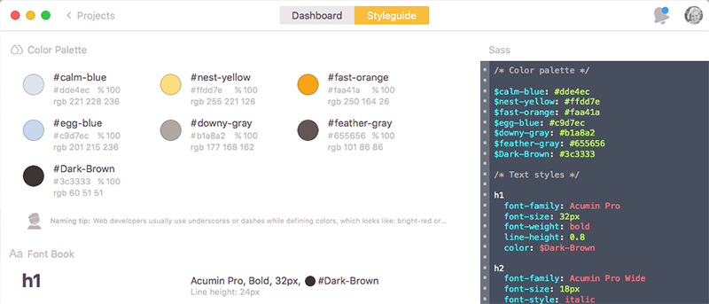
As a designer, I can identify the color palette and font styles used in a design, then specify a CSS class name and add it to the project’s Styleguide for the developer to access.
The capabilities abound: I can add colors from my screens to add to the Zeplin “Color Palette” section of the project’s Styleguide, and even re-name the color for integration with whichever CSS language the developer wants to use. Similarly, I can pull in font styles from my screens to add to the “Font Book” of the same Styleguide; this is helpful for my own review of the typographic rhythm I’ve utilized as well as for the developer. Another bonus feature I’ve recently utilized is the Slack integration; when I post a new screen or comment on a project in Zeplin, my team instantly gets a notification in our slack channel. All-in-all, Zeplin has been a huge time-saver as a designer and seems to reduce a lot of guessing on the part of the developer.
This process is, of course, not perfect. The output to Zeplin is only as good as the input by the designer. For example, if the designer doesn’t stick to their own typographic rhythm or color palette, the Styleguide of the Zeplin project won’t be concise and/or useful for the developer. If the designer uses any kind of “hack-y” designing (like, ya know, taking a screenshot of the current app and then using masks to adjust the spacing between objects instead of re-creating it all… of course I would never do that), it will be confusing when the developer clicks around to determine sizing or spacing. There is much more transparency in exactly how a screen was created, to the point that the developers will be able to call you out on your inconsistencies (and will probably love doing it, if they’re anything like my team!).
Notes
I should also mention there’s a similar communication tool called Avocode which has the same feature set as Zeplin and then some. My team also tried out that app, but ended up going with Zeplin because it was more lightweight, cost effective and has incredibly responsive customer service.
** I started using Sketch as my design tool of choice instead of any of the Adobe tools shortly before learning this approach. This is a topic for an entire blog post on its own, so I’ll suffice to say: designers, just make the switch.
Falling Water photos by Franklin Heijnen and Joe Wolf


